The Power of Colors: What Your Palette Says About You
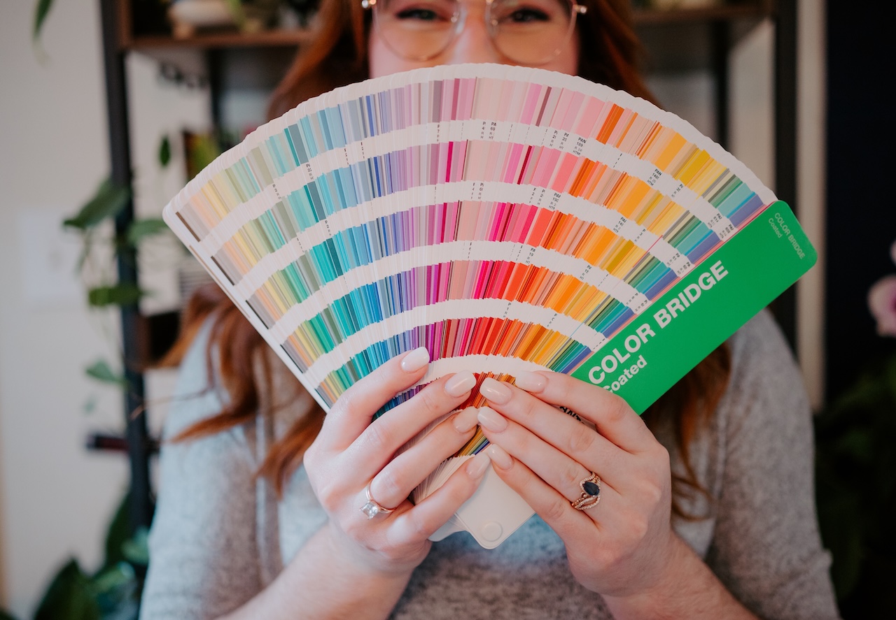
Hello friends! Welcome back to the Brand Studio Creative blog! This week, we’re diving into one of our favorite topics here at Brand Studio Creative: color. Because color isn’t just decoration, it’s communication. The shades you choose for your brand quietly (or boldly) tell your audience who you are before you say a single word. Whether it’s the calm confidence of navy, the warmth of terracota, or the boldness of electric yellow, color psychology plays a crucial role in how your brand is perceived and how people feel when they interact with you.
At Brand Studio Creative, we often remind our clients: your color palette is your visual voice. Let’s explore what your colors are really saying, and how to use them intentionally to connect with your audience.
Every Color Tells a Story
Colors carry emotional weight. They influence how people feel about your brand and what they expect from it. For instance, blue conveys trust and professionalism, while green often reflects balance, health, or sustainability. Yellow radiates optimism and energy, while black communicates luxury, strength, and sophistication.
When you choose a palette, you’re choosing the story your brand tells before anyone reads a single word.

Brand Studio Creative Pro Tip:
Don’t just pick your favorite color; pick the color that aligns with your message. Ask yourself: What emotion do I want my audience to feel when they land on my website or see my logo? From there, build your palette around that feeling. Your colors should amplify purpose, not just match your taste.
Color Creates Consistency
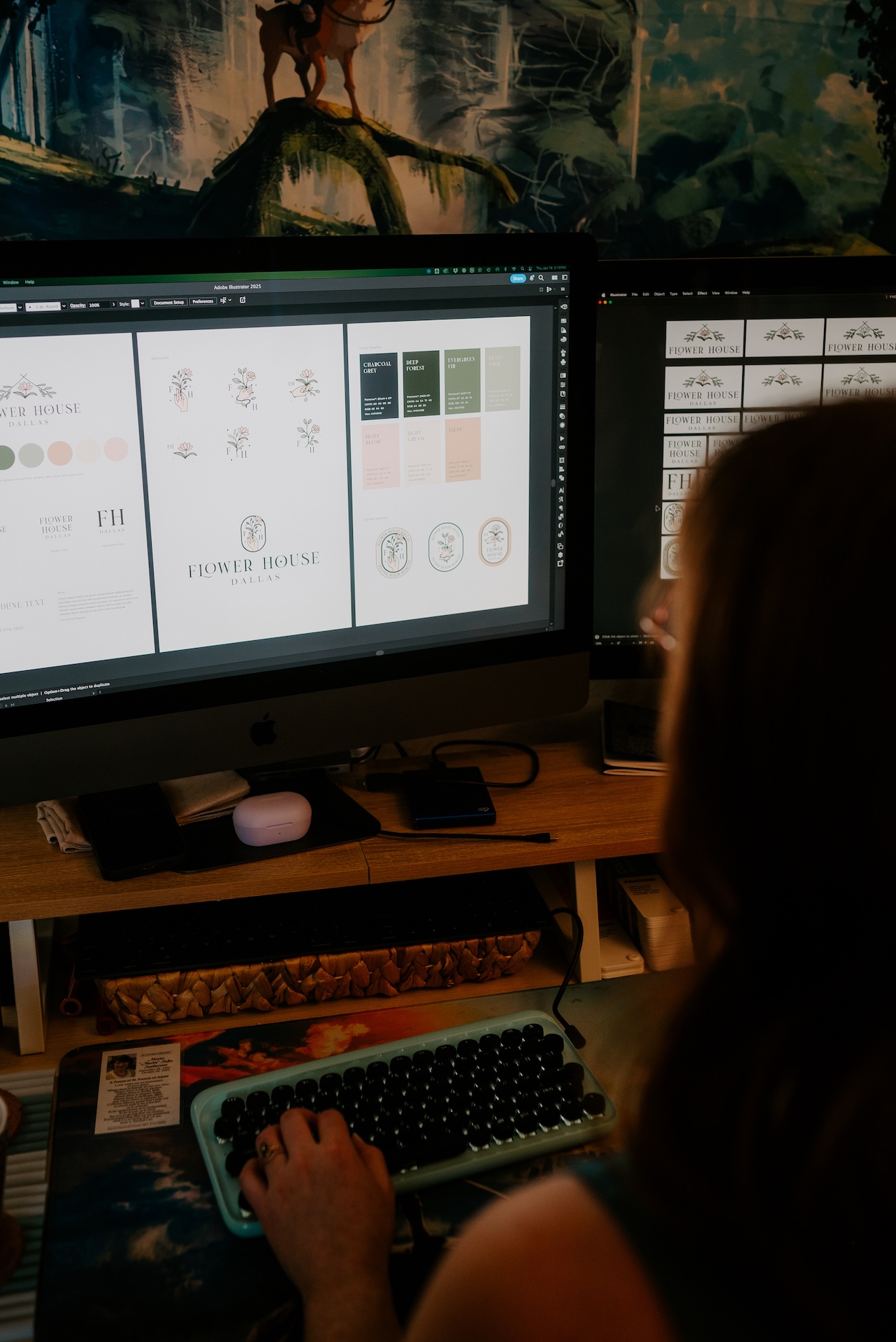
Strong brands are instantly recognizable. Think of Tiffany’s blue box or Coca-Cola’s red; those colors are the brand. That’s the power of consistency. Using a defined color palette across your website, social media, packaging, and marketing materials builds recognition and trust. Inconsistent use of color, on the other hand, confuses your audience. If your Instagram feels warm and friendly, but your website is sterile and corporate, your message feels disconnected.
Brand Studio Creative Pro Tip:
Document your brand colors in a style guide, complete with HEX, RGB, and CMYK codes. That way, every designer, partner, or team member can use them consistently. Consistency doesn’t mean boring; it means recognizable. And in branding, recognition is gold.
Color Impacts Behavior
Beyond aesthetics, color drives action. Studies show that color can increase brand recognition by up to 80% and influence decisions in just seconds. For example, red can create a sense of urgency (great for call-to-action buttons), while soft blues can increase feelings of calm and clarity, perfect for brands that focus on wellness or education.
When used intentionally, color doesn’t just look good; it performs.

Brand Studio Creative Pro Tip:
Test how your colors perform in real life. Try different button shades or accent hues in your email designs or ads. Sometimes a subtle shift in color contrast can boost clicks, engagement, and conversions without changing anything else. Your audience’s reactions can guide you toward your best-performing palette.

Brand Color Personality
Every brand has a personality: bold and confident, calm and nurturing, playful and creative, or elegant and refined. Your color palette is how that personality shows up visually. A luxury brand might lean on muted tones, gold accents, and deep neutrals that evoke sophistication; a wellness brand may gravitate towards soft greens, whites, and sand tones that feel fresh and balanced; while a creative agency could thrive on bold contrasts, unexpected combinations, and pops of colors that spark curiosity and energy.
Brand Studio Creative Pro Tip:
Create a “mood board” that captures how you want your brand to feel, not just how it looks. Include lifestyle images, textures, and even music that represents your vibe. Then, build your color palette from that inspiration. It’s not just about colors, it’s about the energy behind them.
Evolve Authentically
Your brand will evolve, and your color palette as well. The key is to update it intentionally, not impulsively. Adjust tones to reflect a more mature direction, or expand your palette to include new secondary colors for flexibility. However, if your colors change too dramatically, you risk confusing your audience and losing that visual recognition you’ve built.

Brand Studio Creative Pro Tip:
When refreshing your brand palette, keep one or two “anchor” colors that tie back to your original identity. Then, experiment with new accents that align with your growth. This way, you evolve with your audience, not away from them.
Emotional Neutrals
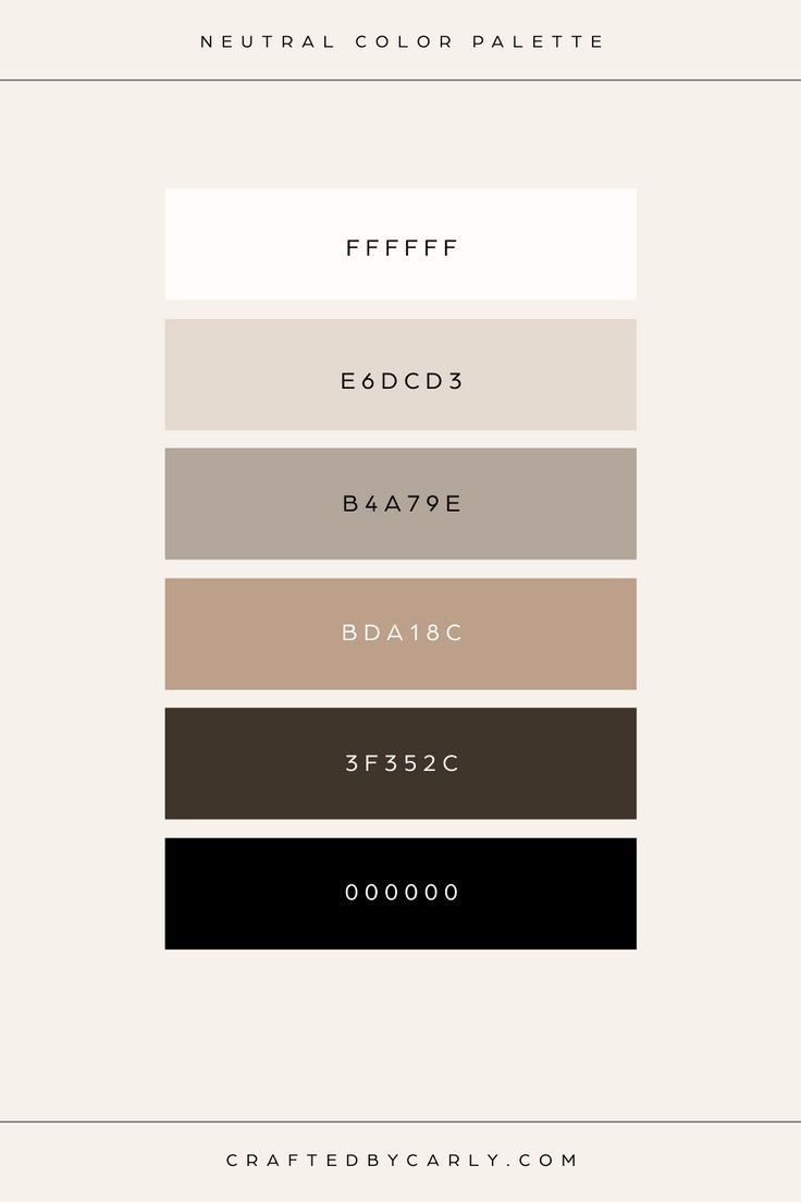
Neutrals are often underrated, but you’re the glue that holds your palette together. Whites, creams, grays, and taupes create breathing room, making your bold colors pop. They also set the tone; cool neutrals feel modern and sleek, while warm neutrals feel cozy and approachable. When used intentionally, neutrals bring balance and sophistication, giving your brand space to breathe while still feeling cohesive.
Brand Studio Creative Pro Tip:
Don’t treat neutrals as an afterthought. Test your accent colors against different neutral backgrounds to see how they hold up. Sometimes, changing the neutral base (from pure white to a soft ivory, for example) can transform the entire look and feel of your brand.
Psychology of Contrast
Contrast isn’t just visual, it’s psychological. When you combine complementary colors or balance light and dark, you create depth and interest. Too little contrast can make your brand feel flat; too much can feel chaotic. The right balance draws the eye where you want it to go: your logo, call-to-action, or key message. When used strategically, contrast becomes a silent guide that directs attention, shapes emotion, and strengthens your brand’s visual hierarchy.

Brand Studio Creative Pro Tip:
Use the 60-30-10 rule: 60% dominant color, 30% secondary, 10% accent. It keeps your visuals balanced, highlights key elements, and guides the eye naturally without overwhelming your audience. This simple framework also creates a cohesive, professional look across all your brand materials.
Your brand palette isn’t just about looking good; it’s about being understood. The right colors create emotional resonance, communicate your values, and build trust with your audience. When chosen with purpose, your palette becomes a living part of your brand story, one that connects, inspires, and stays memorable long after the first impression.
At Brand Studio Creative, we help entrepreneurs and small businesses define color palettes that align with their purpose, personality, and audience. Because when your colors speak clearly, your brand speaks confidently.

Did any of these points resonate with you? Why not take the next step? Reach out to Brand Studio Creative and see how collaboration can take your brand to new heights! Let us help you every step of the way!
Book a FREE 1:1 Branding Consultation Call and let us guide you through this incredible journey. Together, we can make magic happen!
XOXO, Katie
Are you struggling with your brand?
Knowing where to start is hard, but we are here to make this process streamlined and effortless. We care about the success of your company and ensure that your brand represents YOU and your vision. Our team is lead by a master’s in brand strategy and communications CEO working hard so you can expect that your business will be visually consistent both digitally and in print.

Subscribe to the Newsletter
Join my mailing list to receive the latest news and updates from me.
You have Successfully Subscribed!